Paga: A Bold ASCII-Inspired Display Font for Digital Design
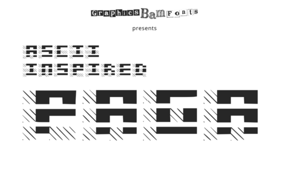
As a UI designer who ships landing pages, SaaS dashboards, and brand-forward e-commerce experiences, I reach for display fonts not just for flair—but for function. Paga stands out because it delivers expressive impact without sacrificing clarity or digital legibility. It’s a display font built from the ground up with grid discipline and ASCII’s tactile energy—think sharp corners, deliberate spacing, and a monospaced rhythm that feels both nostalgic and unmistakably modern.
Paga isn’t meant for paragraphs or long-form body text. It thrives where attention must land instantly: hero section headlines, product name treatments, CTA buttons on high-conversion landing pages, and banner graphics for online stores. Its structured aesthetic creates strong visual hierarchy by default—readers scan faster when type has clear weight contrast and consistent character width. On mobile, that predictability translates to cleaner line breaks and fewer awkward hyphenations in tight viewport widths.
In practice, I’ve used Paga as the sole typographic anchor for a creative portfolio site—pairing it with Inter for all body copy and navigation. The contrast works because Paga’s bold, architectural presence commands focus above the fold, while Inter’s neutral openness supports scanning, reading, and interaction. That pairing is repeatable: any well-designed sans serif (like Manrope, DM Sans, or Clash Grotesk) balances Paga’s personality without competing. For editorial or luxury-leaning digital brands, a restrained serif like IBM Plex Serif or Charter adds sophistication while letting Paga retain its role as the voice—not the background.
What makes Paga especially useful for digital products is its intentional restraint. Unlike many decorative display fonts, it avoids excessive flourishes or unpredictable alternates. Every glyph aligns cleanly to an implied pixel grid, which means it renders crisply at 48px on desktop and remains legible—even at 32px—on iOS and Android. I’ve tested it over dark gradients, light image overlays, and solid-brand-color backgrounds: its high x-height and generous counters keep letterforms open and readable, even with subtle text shadows or subtle backdrop blur.
For conversion-focused layouts, Paga performs best in short, high-impact contexts. A “Get Started” button set in Paga at 20px (with letter-spacing of 0.5px) reads confidently on both light and dark mode interfaces. On a course sales page, using Paga for the headline—“Build Your First Web App in 7 Days”—immediately signals craftsmanship and intentionality. That tone reinforces trust before the first sentence is read. Similarly, boutique online stores use Paga for collection banners (“Limited Edition Drops”) or seasonal headers (“Summer Edit”), where brand voice and timing matter more than subtlety.
It’s also effective in logo design when the brand identity leans into digital-native, developer-adjacent, or maker-culture spaces. Think indie SaaS tools, coding bootcamps, or design toolkits—the kind of brands where ASCII references feel authentic, not ironic. Because Paga avoids cartoonishness or retro gimmicks, it scales gracefully across touchpoints: favicon letterforms, social media cover graphics, email header text, and even animated SVG text in micro-interactions.
When implementing Paga on live sites, I always verify webfont availability. It ships as WOFF2—ideal for fast loading—and includes uppercase-only glyphs, which suits its display purpose perfectly. There are no italic variants or variable axes, but that’s by design: Paga is a focused tool, not a full typographic system. Its simplicity means faster load times, fewer render-blocking requests, and predictable fallback behavior if needed. For multilingual projects, confirm coverage—Paga supports Latin-based languages including accented characters used in French, Spanish, and German, making it viable for global-facing landing pages or regional campaign assets.
Readability on small screens demands extra care. I avoid setting Paga below 24px on mobile, and never use it for interactive elements smaller than 44×44px—buttons need breathing room, and Paga’s structural clarity shines when given space. For image overlays, I apply a subtle semi-transparent background behind the text or use a soft outer glow instead of heavy stroke effects, preserving its clean geometry.
Pairing Paga thoughtfully extends beyond aesthetics—it supports brand consistency. When your blog headers, app onboarding screens, and product packaging all share the same display voice, users subconsciously register cohesion. That’s especially valuable for creative entrepreneurs launching digital templates, Notion workspaces, or Figma UI kits: Paga becomes part of the asset’s identity, not just decoration. And because it’s a premium font licensed for commercial use, you can embed it safely across client websites, Shopify themes, SaaS dashboards, and downloadable brand kits—no attribution required, no usage caps.
One practical note: always license Paga directly from the foundry or an authorized reseller. Free alternatives may mimic ASCII styling, but they rarely match Paga’s precision in hinting, kerning pairs, and responsive rendering. For client work or production environments, verify the license covers web embedding, app bundling, and resale in digital templates—some licenses restrict redistribution, so check before shipping a Figma community file or WordPress theme.
Ultimately, Paga earns its place in my font library because it solves real problems: cutting through visual noise, reinforcing brand tone without explanation, and holding up across devices and contexts. It’s not a background player—it’s the confident first sentence of your digital story. Used with intention, it doesn’t just look bold. It works boldly.